



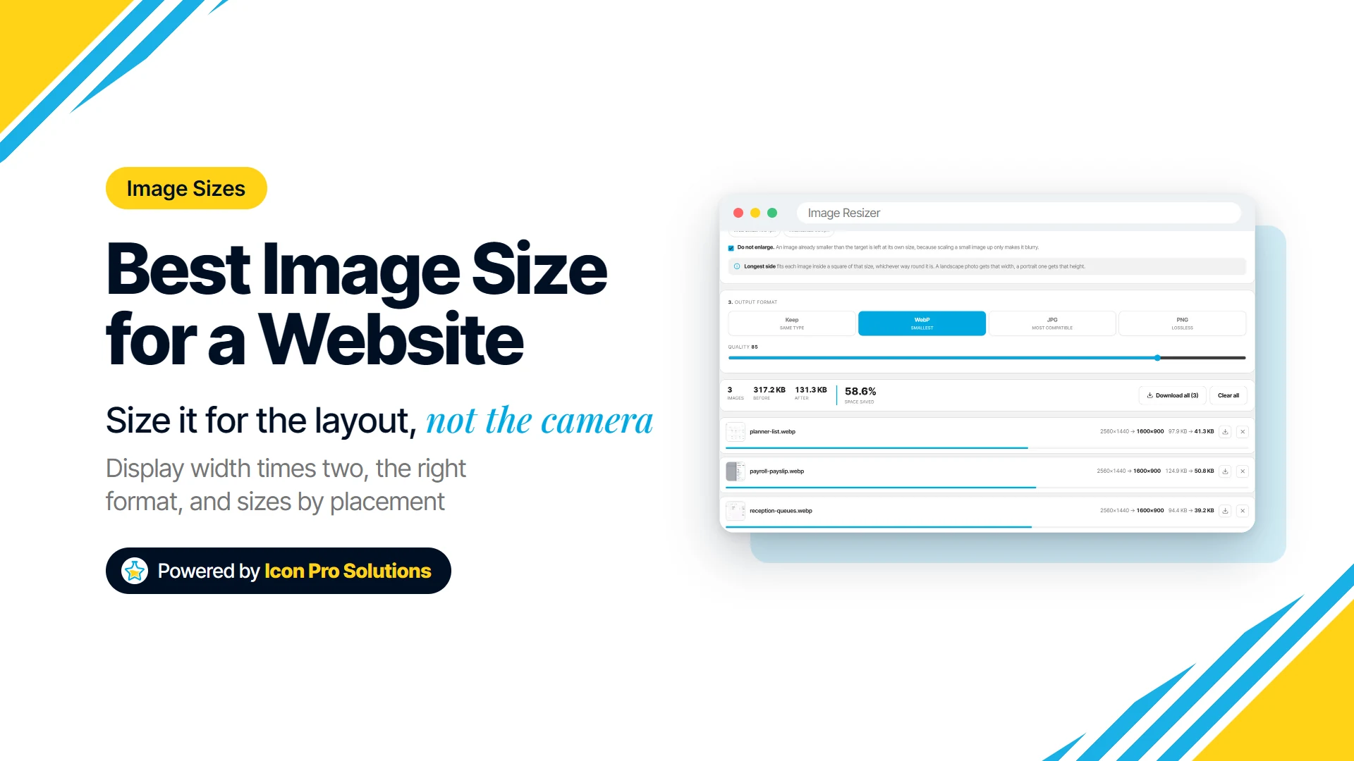
There is no single best image size for a website. The right size for any image is the largest width your layout actually shows it at, roughly doubled so it stays sharp on high‑density screens.
This guide is for business owners and marketers who upload their own images. It shows you how to work out that width, gives starting sizes for heroes, blog images, logos and more, and explains when to use WebP, JPG, PNG or SVG.
Key Takeaways
- Size each image to the widest it is displayed on the page, times two. A photo shown in an 800px column needs to be about 1,600px wide, not the 4,000px or so a phone camera often produces.
- Never scale a small image up to hit a target size. Enlarging invents pixels, so the result looks soft.
- Use WebP for most photos and graphics, JPG when an older system needs to open the file, PNG for pixel-exact screenshots, and SVG for logos and icons where you can.
- A full-width hero is the one place to stop short of doubling: 1,920 to 2,560px wide is a sensible range for the heaviest photo on the page.
- The table below gives starting points by placement, not standards. Your theme’s column widths decide the real numbers.
Is There a Single Best Image Size for a Website?
No, because the same site shows images at very different widths. A banner can stretch across the whole screen while a team photo sits in a 300px card, and one size cannot be right for both.
The rule that works everywhere is simple: find the width the image is displayed at, then double it. The doubling is for high-density screens, which draw two or more real pixels for every pixel the layout measures.
Google’s web.dev guide explains why this matters: “Images with lower pixel densities can look fuzzy.” Some screens pack in more than two, but tripling every image makes files much heavier, so twice is a practical middle ground.
How Do You Find the Width an Image Is Displayed At?
Open the page on a desktop screen, since that is usually where images are widest. In Chrome, right-click the image, choose Inspect, and hover over the image’s file address in the panel that opens: it shows the rendered size next to the file’s own size.
If the rendered width is 750px, your target is about 1,500px. If the site was built for you, the person who built it can also tell you the width of each column and card in the theme.
What Size Should Each Type of Image Be?
Use this table as a starting point, then check it against your own layout. The display widths are examples, so replace them with what you measured.
| Placement | If it displays at about | Upload it at | Image Resizer setting |
|---|---|---|---|
| Full-width hero or banner | the whole screen | 1,920 to 2,560px wide | Web large preset (2048px) |
| Image in a blog post or text column | 700 to 800px | 1,400 to 1,600px wide | Web medium preset (1600px) |
| Half-width image beside text | 600px | 1,200px wide | Width 1200 |
| Link preview or share image | set by the platform | 1,200 x 630 | Link preview preset |
| Product, card or team photo in a grid | 400px square | 800 x 800 | Exact size 800 x 800, Fill |
| Small thumbnail | 150px | 320px | Thumbnail preset (320px) |
| Logo in the header | 40 to 60px tall | SVG, or twice the display height | None needed for SVG |
| Favicon | a browser tab | a square, over 48 x 48 | Crop to a square first |
Three placements need a word of explanation. For a hero, doubling a 1,440px laptop screen would give 2,880px, which makes the heaviest image on the page heavier still, so the range stops at 2,560px.
For a logo, SVG is the best choice where your theme accepts it, because it is drawn from shapes rather than pixels and stays sharp at any size. For a favicon, Google says: “we recommend using a favicon that’s larger than 48x48px so that it looks good on various surfaces.”
Should You Use WebP, PNG or JPG?
Use WebP for most images on a website, because it gives smaller files at the same visual quality. caniuse.com lists support in current Chrome, Edge, Firefox and Safari, so the other formats are now for specific jobs.
| Format | Use it for | Watch out for |
|---|---|---|
| WebP | photos, graphics, images with transparency | older tools, such as some email newsletter builders, may expect JPG or PNG |
| JPG | photos that an older system has to open | no transparency: transparent areas need a background |
| PNG | screenshots and graphics that must stay pixel‑exact | large files for photographs, because it is lossless |
| SVG | logos, icons and simple illustrations | not for photos, and some sites do not accept SVG uploads |
A common reason to reach for PNG is transparency, but WebP handles that too. Google’s WebP documentation says: “Lossless WebP supports transparency (also known as alpha channel) at a cost of just 22% additional bytes.”
Animated GIFs are a special case. Our Image Converter keeps only the first frame of one, because a browser canvas cannot read the rest, so leave animations as they are or replace them with a short video.
How Do You Resize and Convert Images Before Uploading?
Resize first, then convert, and do both before the file ever reaches your site. Two free tools on our site do this in your browser, so your images are never uploaded.
- Measure the display width of each spot, as above, and double it.
- Resize in the Image Resizer. Set a longest side, or pick a preset such as Web medium (1600px), Web large (2048px) or Thumbnail (320px). For a fixed box like a card or a link preview, choose Exact size with Fill, and use the nine-square grid to pick which part of the photo to keep.
- Leave “Do not enlarge” switched on. It is on by default, so an image already smaller than your target stays at its own size instead of going blurry.
- Choose the format. The resizer can save as WebP, JPG or PNG in the same pass. If you only need a new format, the Image Converter turns JPG, PNG, GIF, BMP, SVG and AVIF files into WebP, JPG or PNG.
- Set the quality. Both tools start at 85, and the converter’s own guidance is that 80 to 90 is the usual sweet spot.
- Download. Each row has its own button and shows the size before and after, and Download all gives you every image in one ZIP file.
The resizer writes a fresh file, so the camera and GPS location data in a phone photo does not come along.
If your site already feels slow and you want to know whether images are the cause, our guide to why a website is slow walks through how to measure it. For images that overflow on phones, see how to build a responsive WordPress website.
When Should You Get Help With Website Images?
Get help when the images are sized well and the site is still slow, or when there are hundreds of old images to fix. At that point the work is in the theme, the image settings and the hosting, not in each file.
Our website speed optimization service measures what is holding your pages back and fixes it. If you would rather talk it through first, book a free consultation.
FAQs
Do I Need a Different Image for Mobile?
Not for size alone, because a page can offer several sizes of one image and let each phone pick a smaller one. A different crop is another matter: MDN explains that “the art direction problem involves wanting to change the image displayed to suit different image display sizes,” and that needs a separate mobile image, set in your page builder where it supports one, or in code.
Will WordPress Resize My Images for Me?
Partly. WordPress’s developer documentation says that “If the original image width or height is above the threshold, it will be scaled down,” with a default threshold of 2560px, and “WordPress automatically creates several sizes of each image uploaded to the media library.” It still does not know how wide your layout is, so sizing images yourself before upload is the surest way to get the size you want.
Can I Upload iPhone HEIC Photos to My Website?
Not if you want everyone to see them. caniuse.com lists HEIC support in Safari only, not in Chrome, Edge or Firefox, and notes that “It is hard for browsers to support HEIC because it is complex and expensive to license.”
Our Image Converter is not a HEIC converter either. Export the photo as JPG on the phone first, or set the camera to Most Compatible so it saves JPG from the start, then resize it as normal.
How Small Should an Image File Be in KB?
No official limit exists, so judge by the size in pixels first and the quality second. Resize to the display width times two, save as WebP at a quality of about 80 to 90, and check the result at full size: if it looks right, it is small enough.