




Have you ever finished building a layout only to discover it completely breaks when a user increases their browser font size? Or spent several minutes manually converting pixel values into REM just to get consistent spacing across your stylesheet? These small repetitive tasks quietly slow down your workflow more than you realize.
There is a simpler way to handle it, and it takes less than a second.
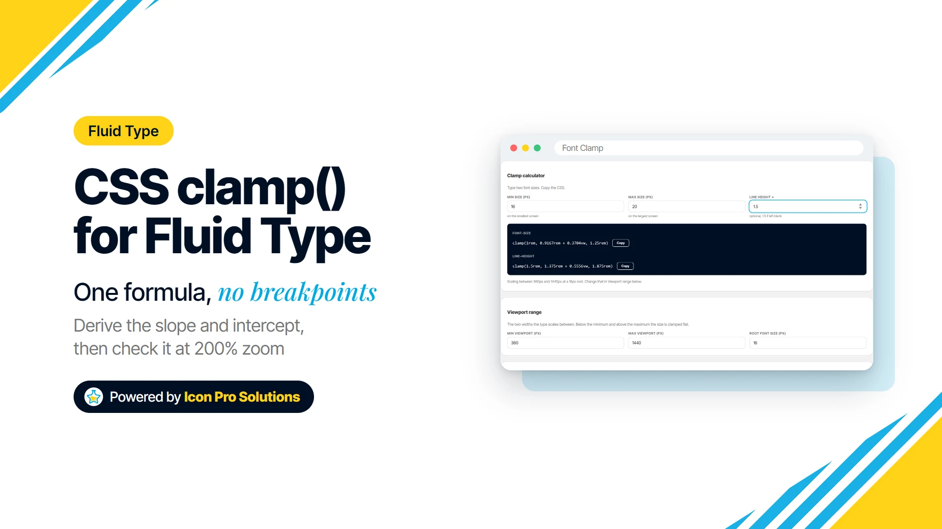
At Icon Pro Solutions, we build free, fast, browser-based tools designed to save time without compromising privacy. Our Font Clamp calculator is one of them. You type sizes in pixels, it converts them to REM against your root font size, and it gives you fluid clamp() values ready to paste into your CSS. There is no sign-up, and nothing you type is uploaded.
What Is a REM Unit?
REM stands for Root EM. Unlike em, which is relative to a parent element, rem is always relative to the root <html> font size. This makes it far more predictable across layouts and components.
Most browsers use a default root font size of 16px, which makes conversion straightforward and consistent.
-
1rem: 16px at default browser settings
-
1.5rem: 24px at default browser settings
-
2rem: 32px at default browser settings
-
0.75rem: 12px at default browser settings
How to Convert PX to REM
The conversion is simple. You divide the pixel value by the base font size of the root element.
Formula: REM = PX ÷ Base Font Size
Here are a few examples using the default 16px base value:
-
24px ÷ 16 = 1.5rem
-
48px ÷ 16 = 3rem
-
12px ÷ 16 = 0.75rem
-
36px ÷ 16 = 2.25rem
Font Clamp does this arithmetic for you. Set your root font size once, type your sizes in pixels, and it writes the REM values.
Why Use Font Clamp for PX to REM?
A plain PX to REM conversion gives you one fixed value. Font Clamp goes a step further: each size becomes a clamp() value that grows smoothly between a small screen and a large one, in REM, so it still respects the reader’s browser font size.
-
Runs in your browser: Your type scale is kept in your own browser storage so it survives a reload. It is never uploaded.
-
REM output: Every size is converted to REM against the root font size you set, 16px by default.
-
Fluid sizes: Each size scales between a minimum and a maximum viewport width that you choose.
-
Copy or download: Copy a single value, or export a whole scale as CSS custom properties.
-
Preview: Each size is rendered at its own value, so you can see it before you use it.
-
Matching line heights: Set a ratio and get a line height to go with every font size.
The Case for REM in Modern CSS
Using pixels for everything may feel simple, but it creates serious limitations in accessibility and scalability. REM solves this by respecting user preferences.
When users increase their browser font size for accessibility reasons, pixel based layouts stay fixed. This can break readability and user experience. REM based layouts scale automatically with user settings.
This makes REM especially powerful for responsive design systems where consistency matters across devices.
Who Is This Tool For?
-
Developers: Quickly convert design specs into scalable CSS units.
-
Designers: Build consistent spacing and typography systems.
-
Content managers: Adjust styles in CMS environments without guesswork.
-
Students: Learn how relative units work in real CSS workflows.
How to Convert PX to REM with Font Clamp
Getting started is simple and requires no setup.
-
Open the tool: Go to Font Clamp.
-
Set the root font size: Use your project root font size, usually 16px.
-
Enter your sizes: Type the smallest and largest size in pixels. Font Clamp converts both to REM.
-
Set the screen range: Choose the smallest and largest viewport width the size scales between.
-
Copy and use: Copy the CSS straight into your stylesheet.
Frequently Asked Questions
Q: Does the tool store my input?
A: Your scale is kept in your own browser storage so it survives a reload. It is not uploaded.
Q: Do I need an account?
A: No account is required. The tool is free to use.
Q: Can I use a custom base font size?
A: Yes. Set the root font size to match your project and every value is converted against it.
Q: Can I get a single value instead of a whole scale?
A: Yes. Use the Clamp calculator at the top of the page: two sizes in, two formulas out.
Ready to Simplify Your Workflow?
The next time you find yourself manually converting pixel values, there is a faster way. At Icon Pro Solutions, we focus on building tools that remove friction from everyday development tasks so you can focus on building better products.