




Fluent Forms shows your visitor a message after almost every click on Submit: a thank-you note, a red line under a missed field, a list of errors, a grayed-out button while it sends, or a notice that the form is closed. Out of the box those messages use the plugin’s own gray, red and blue, which rarely match the rest of your site.
To change Fluent Forms message colors, you need one CSS rule per response. This guide shows every one of those responses as it really appears, and the exact CSS that recolors it. Each pair of screenshots below is the same real form, first with the plugin’s default look and then with the stylesheet from this post applied.
Key Takeaways
- Fluent Forms has seven responses a visitor can see: the success message, errors under a field, a format error such as a bad email, an error stack, an error sent back by the server, the sending state of the button and a closed form notice.
- Each one has its own class, so each can have its own colors.
- Paste the CSS into the form’s own Custom CSS panel, or into your theme’s custom CSS if every form should match.
- Prefix a rule with
.fluent_form_and the form number to change one form only. - The submit button needs
!important, because Fluent Forms prints the colors you set in the form editor.
Which messages can Fluent Forms show after a submit?
Before styling anything, it helps to see the form the rest of this guide uses. It has a name, an email and a message field, all required, and a Send Message button.
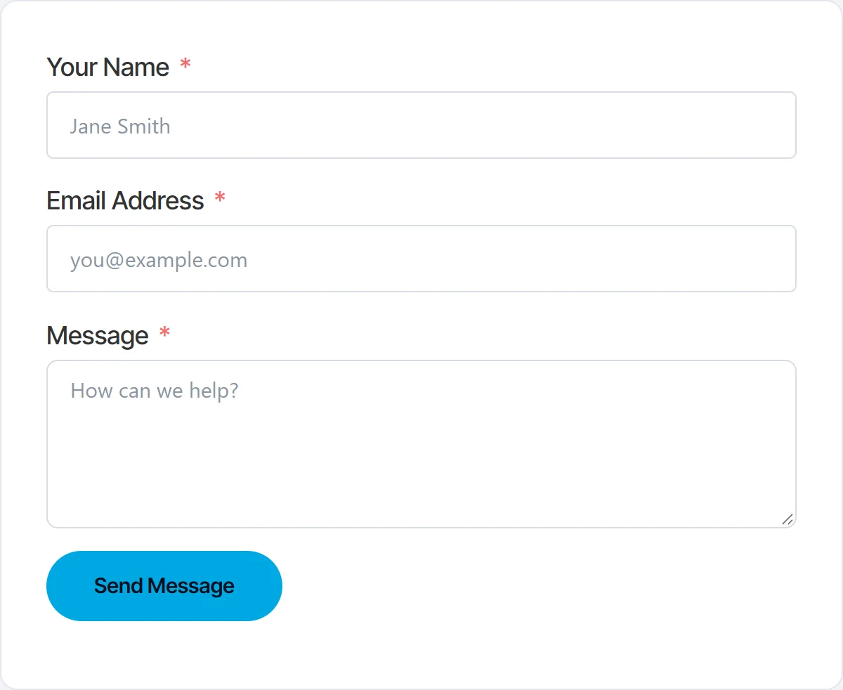
After a click on Send Message, the visitor sees one of these:
- The success message, when everything was accepted.
- A red line under each required field that was left empty.
- A format error, for example an email address without a domain ending.
- An error stack, when the form is set to list all errors together.
- An error from the server, for example an email that has already been used.
- The button in its sending state, while the form waits for the server.
- A notice in place of the form, when the form is closed, full or restricted.
Where do you put the CSS?
Fluent Forms has a Custom CSS box for each form. Open the form, go to Settings & Integrations, then Custom CSS/JS. CSS added there loads only with that form.
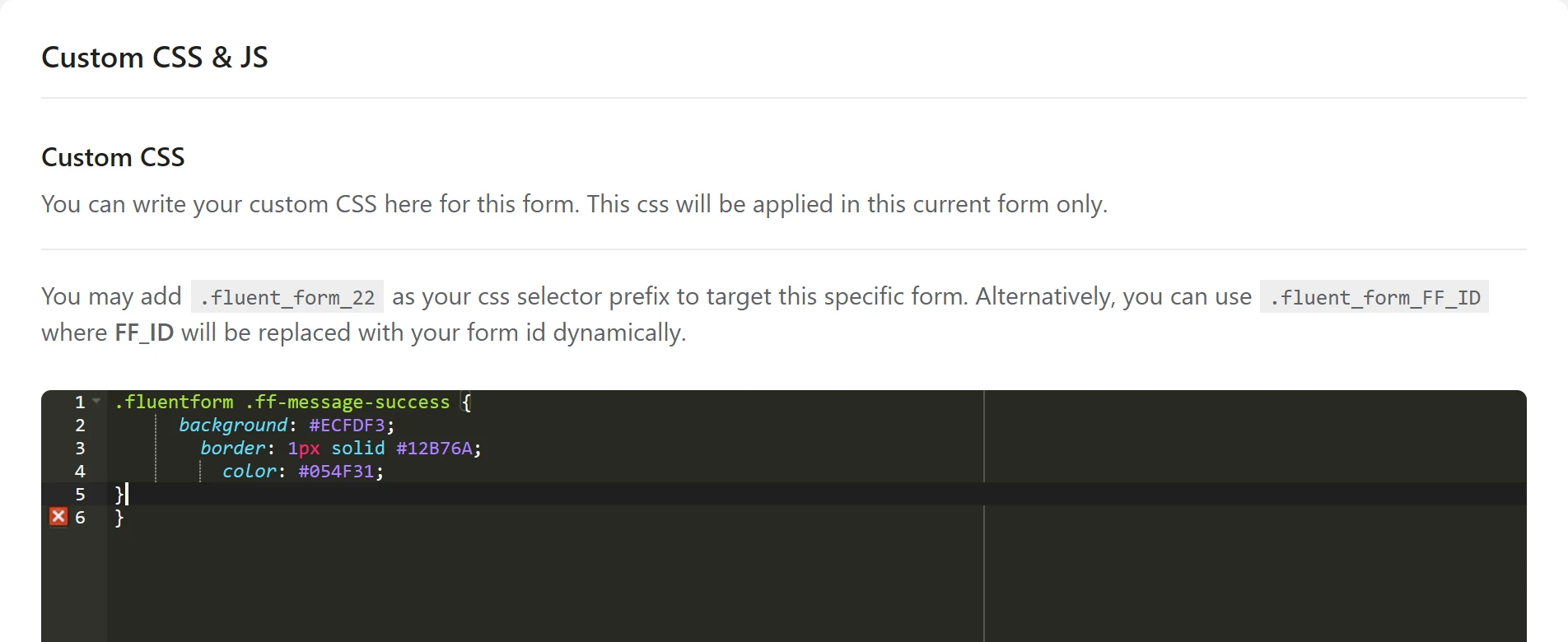
If every form on the site should look the same, put the CSS in one place that loads everywhere instead: Appearance, then Customize, then Additional CSS, or your page builder’s site-wide custom CSS. The selectors in this guide start with .fluentform, which is on every Fluent Forms form, so they work in either place.
These class names were read from Fluent Forms 6.2.5. Plugins do rename things between versions, so if a rule stops working after an update, right-click the message, choose Inspect and compare the class names with the ones below.
1. The success message
The success message is the text Fluent Forms shows on the same page after a good submit. You write it under Settings & Integrations, then Confirmation Settings, with the confirmation type set to Same Page. The After Form Submission option decides whether the form is hidden or reset behind it.
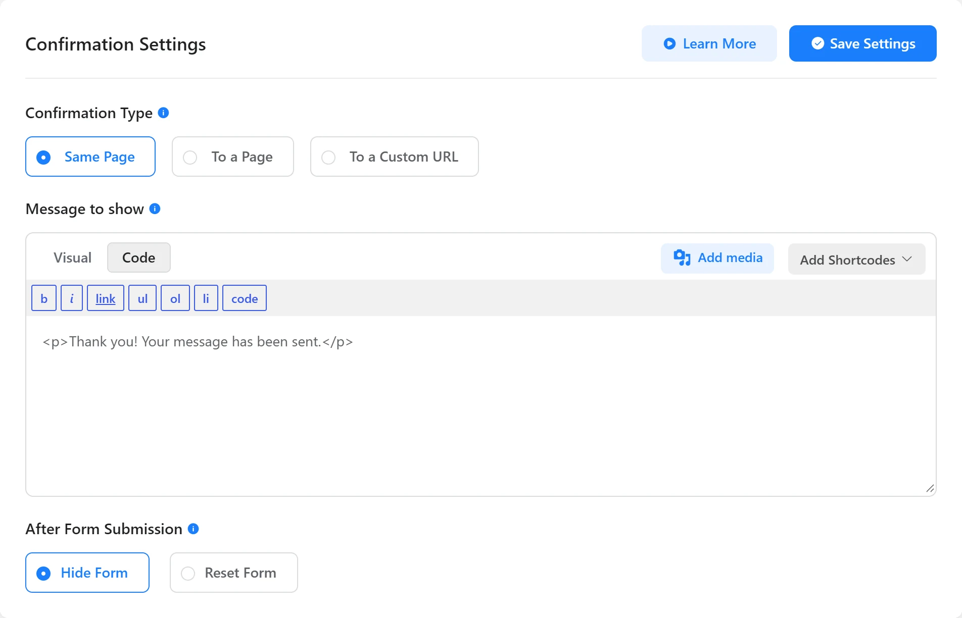
By default the message sits in a plain white box with a thin gray border and a soft shadow.

It is a div with the class ff-message-success, so one rule changes its background, border and text:
.fluentform .ff-message-success {
  background: #ECFDF3;
  border: 1px solid #12B76A;
  border-radius: 8px;
  color: #054F31;
  padding: 16px 20px;
  box-shadow: none;
}
Fluent Forms also gives the message an id made of the form number, such as fluentform_22_success. Use #fluentform_22_success instead of the class when only one form should change.
2. Errors under a required field
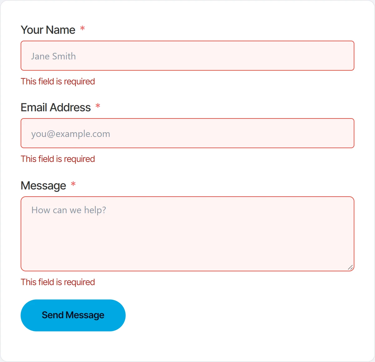
When a required field is left empty, Fluent Forms marks the whole field group with the class ff-el-is-error and puts a short red line under the input. That line is a div with the classes error and text-danger, and it carries role="alert" so screen readers announce it.
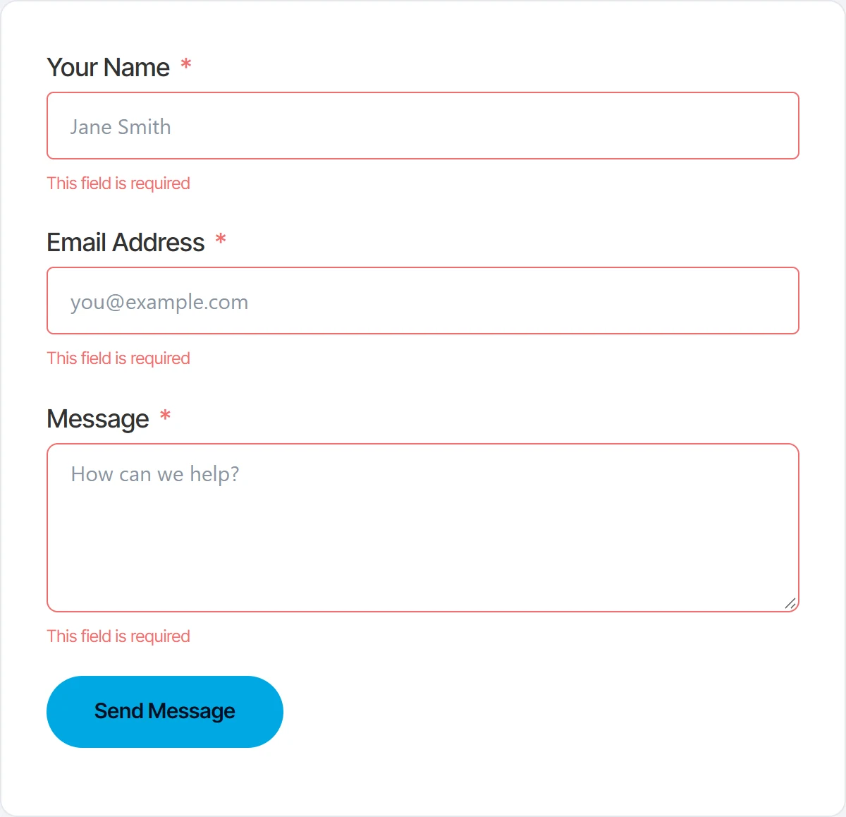
Two rules cover it: one for the text, and one for the field itself, which makes the problem easier to spot on a long form.
.fluentform .ff-el-is-error .text-danger {
  color: #B42318;
  font-size: 14px;
}

.fluentform .ff-el-is-error .ff-el-form-control {
  border-color: #F04438;
  background-color: #FEF3F2;
}
3. An invalid email or other format error
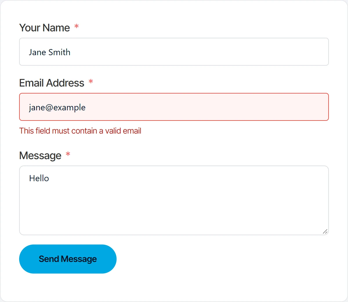
A format error uses exactly the same markup as a missing field, only with a different sentence. Here the email address has no domain ending, and Fluent Forms says This field must contain a valid email.
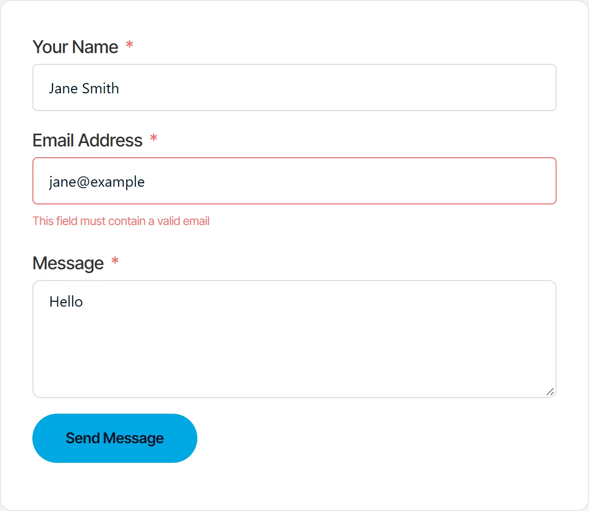
Because the classes are the same, the rules from step 2 already restyle it. There is nothing extra to add.
4. Errors listed together (the error stack)
A form can show every error in one list below the button instead of under each field. The setting is under Settings & Integrations, then Form Layout, then Error Message Position.

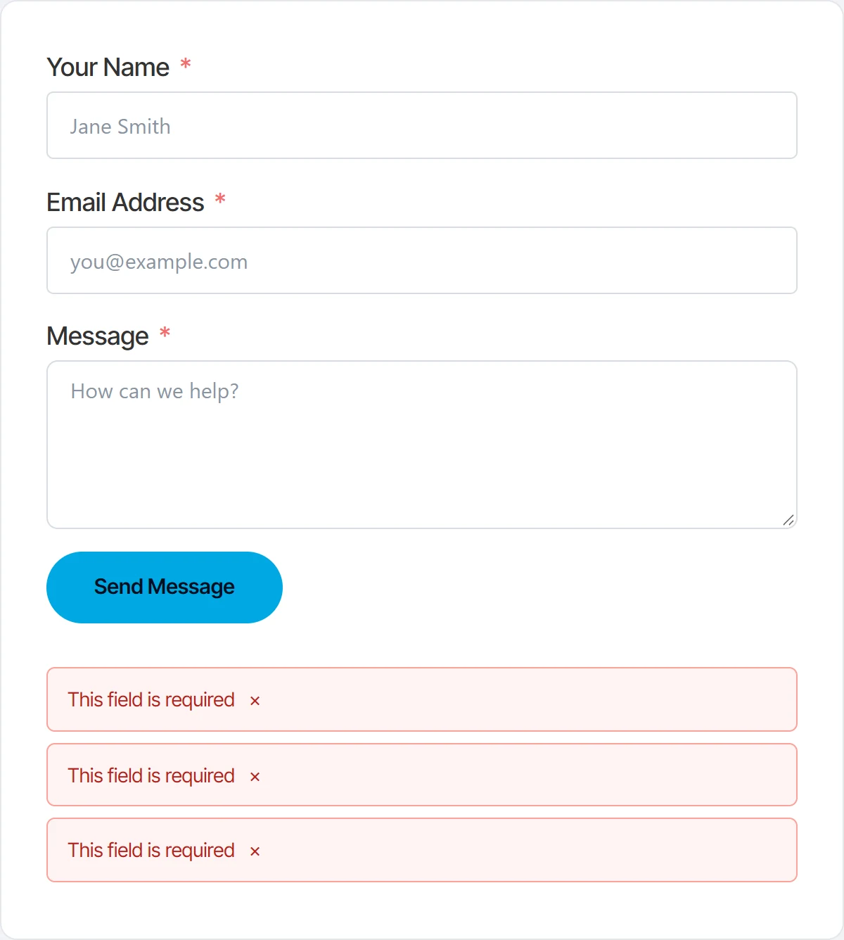
In that mode Fluent Forms writes the errors into a container with the class ff-errors-in-stack, one div with the classes error and text-danger per field. Each has a small close button, a span with the class error‑clear.
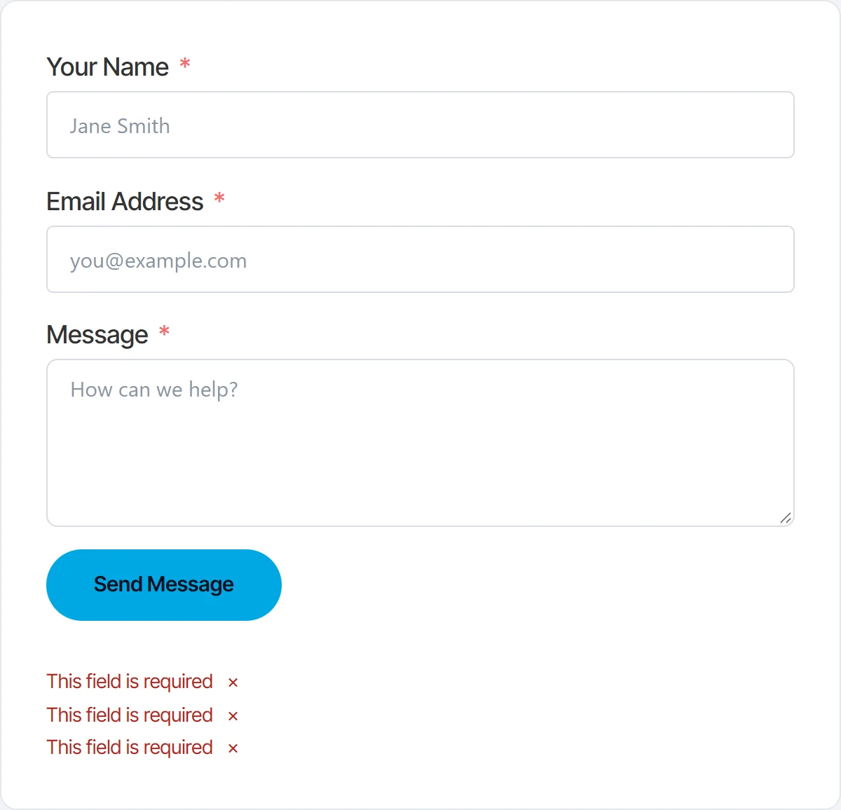
Give each error its own panel and color the close button to match:
.fluentform .ff-errors-in-stack .error {
  background: #FEF3F2;
  border: 1px solid #FDA29B;
  border-radius: 6px;
  color: #B42318;
  padding: 10px 14px;
  margin-bottom: 8px;
}

.fluentform .ff-errors-in-stack .error-clear {
  color: #B42318;
}
5. Errors that come back from the server
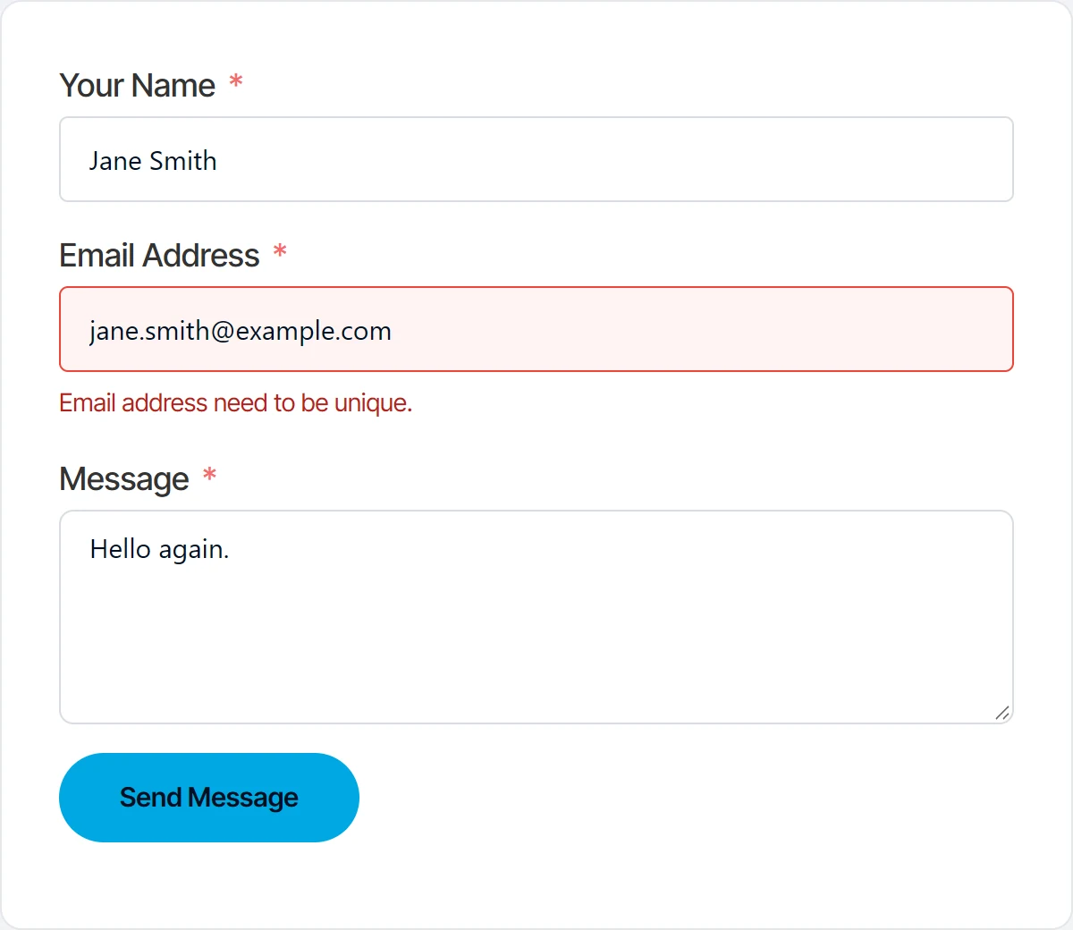
Some checks only happen after the form reaches your website. A field set to accept each email only once is a good example: the browser has no way to know the address was used before. When the server refuses the submission, Fluent Forms shows its answer under the field it concerns.
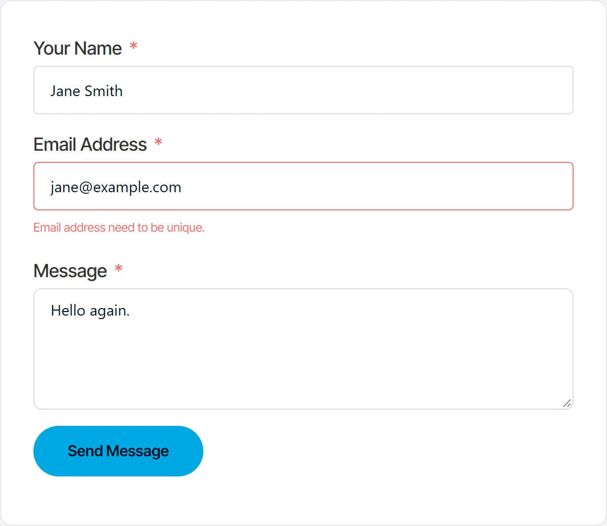
That answer uses the same ff-el-is-error and text-danger classes as the other field errors, so the rules from step 2 style it too.
6. The submit button while the form is sending
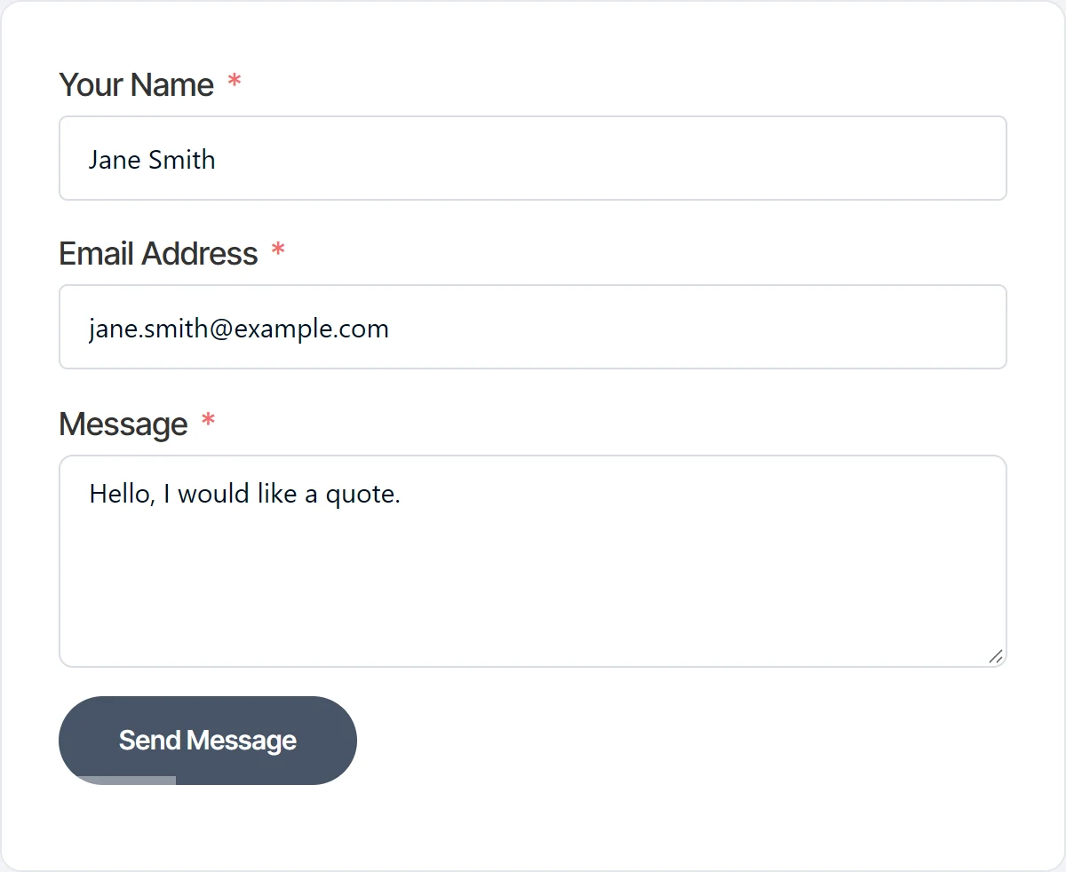
Between the click and the answer, Fluent Forms adds the class ff_submitting to the form and the classes disabled and ff-working to the button, and fades the button to 65 percent opacity. On a slow connection this state can last several seconds, and a pale button can look broken.
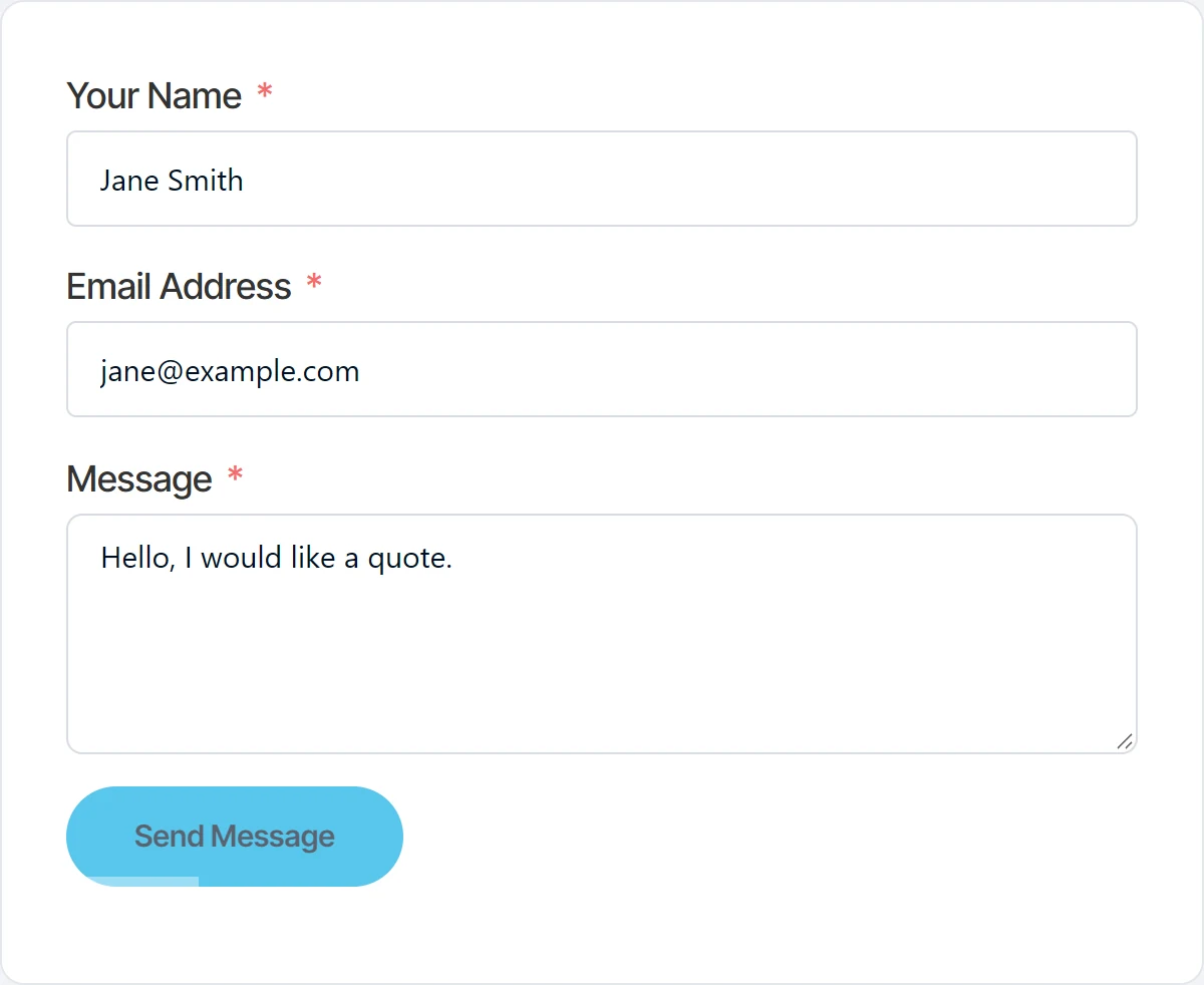
Give the working button a clear color of its own and a waiting cursor. The !important is needed here: Fluent Forms prints the button colors you chose in the form editor, and those win over an ordinary rule.
.fluentform .ff-btn-submit.ff-working {
  background-color: #475467 !important;
  border-color: #475467 !important;
  color: #FFFFFF !important;
  opacity: 1;
  cursor: wait;
}
7. A closed, full or restricted form
Under Settings & Integrations, then Scheduling & Restrictions, a form can stop taking entries: after a number of entries, outside a date range, for visitors who are not logged in, or when a submission is empty. When a form is closed this way, Fluent Forms shows the message you set there instead of the form.
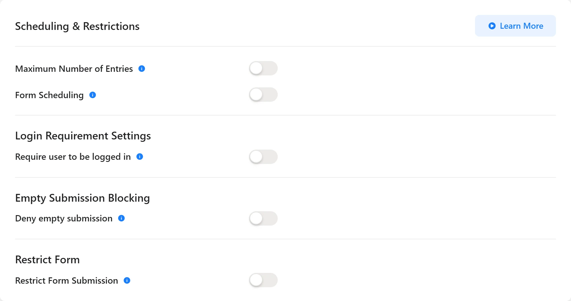
That message is a plain div with the class ff_form_not_render, which picks up your theme’s text style and nothing else.

The form wrapper is not on the page when the form is closed, so this rule does not start with .fluentform:
.ff_form_not_render {
  background: #FFFAEB;
  border: 1px solid #FEC84B;
  border-radius: 8px;
  color: #93370D;
  padding: 16px 20px;
}
All the CSS in one place
This is the whole stylesheet used for the screenshots above. Every text color in it was checked against its background with the WCAG contrast formula, and the lowest pair is 6.05 to 1, above the 4.5 to 1 that normal size text needs.
/* 1: Success message */
.fluentform .ff-message-success {
  background: #ECFDF3;
  border: 1px solid #12B76A;
  border-radius: 8px;
  color: #054F31;
  padding: 16px 20px;
  box-shadow: none;
}

/* 2, 3 and 5: errors under a field, from the browser or the server */
.fluentform .ff-el-is-error .text-danger {
  color: #B42318;
  font-size: 14px;
}
.fluentform .ff-el-is-error .ff-el-form-control {
  border-color: #F04438;
  background-color: #FEF3F2;
}

/* 4: error stack */
.fluentform .ff-errors-in-stack .error {
  background: #FEF3F2;
  border: 1px solid #FDA29B;
  border-radius: 6px;
  color: #B42318;
  padding: 10px 14px;
  margin-bottom: 8px;
}
.fluentform .ff-errors-in-stack .error-clear {
  color: #B42318;
}

/* 6: submit button while sending */
.fluentform .ff-btn-submit.ff-working {
  background-color: #475467 !important;
  border-color: #475467 !important;
  color: #FFFFFF !important;
  opacity: 1;
  cursor: wait;
}

/* 7: closed, full or restricted form */
.ff_form_not_render {
  background: #FFFAEB;
  border: 1px solid #FEC84B;
  border-radius: 8px;
  color: #93370D;
  padding: 16px 20px;
}
How do you change the colors for one form only?
Replace .fluentform with .fluent_form_ followed by the form’s number. The number is in the form’s shortcode: is form 22, so its success message rule becomes:
.fluent_form_22 .ff-message-success {
  background: #ECFDF3;
  color: #054F31;
}
For the success message you can also use its id, #fluentform_22_success, and for the closed notice the id ff_form_22, which Fluent Forms puts on that div.
Why is my CSS not working?
- The page is cached. A caching plugin or a CDN can keep serving the old stylesheet. Clear the site cache and reload the page before you change anything else.
- Another rule is stronger. A theme or page builder can style forms with more specific selectors. Add the form prefix from the section above before you reach for
!important. - The button did not change. Only the sending state needs
!important, because of the colors Fluent Forms prints from the form editor. Its normal and hover colors are easier to change in the form editor itself, under the submit button’s settings. - You tested by submitting a live form. Every test submission on a real form emails whoever is on its notification list. Make a copy of the form, switch off its email notifications and test on that copy.
If your forms, their emails and the rest of the site should simply keep working without you checking them, that is what our website maintenance service is for.