



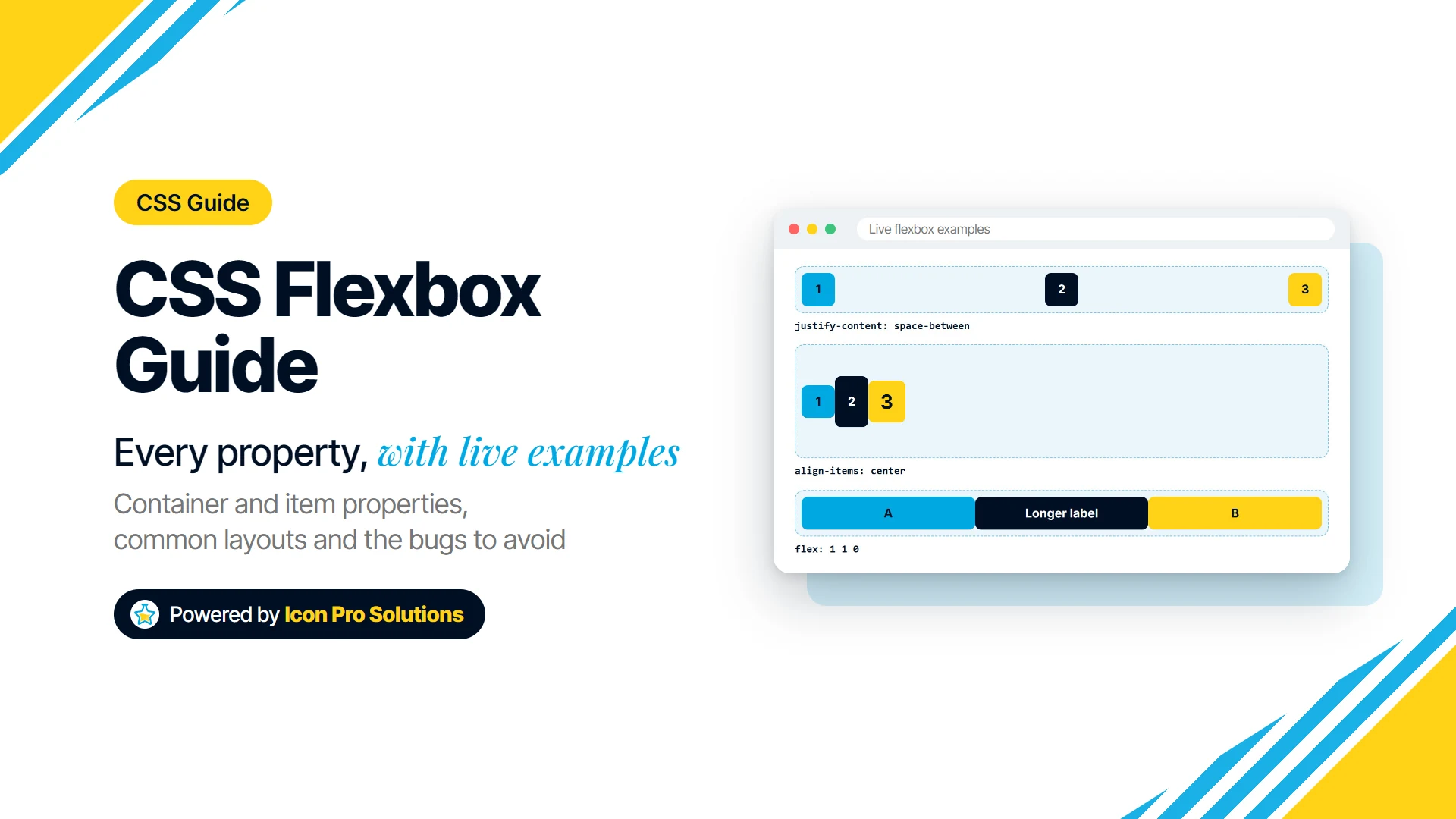
CSS flexbox is the layout tool for putting things in a row or a column and controlling how they share the space. It handles alignment, spacing, reordering and wrapping with a few properties, and every current browser supports it.
This guide covers every flexbox property, on the container and on the items, with a live example for each value. The examples are real flexbox drawn by your browser, so what you see is exactly what the code does. After the properties come the layouts people build most often, and the bugs people hit most often, with the fix for each.
Short on time? This one-minute video walks through the core properties, then the guide covers each one in detail.
display, justify-content, align-items, flex-direction, flex-grow and flex-wrap. Every layout in it is real flexbox, measured in a browser.Key Takeaways
- Flexbox lays items out in one direction at a time: a row or a column. For rows and columns at once, use CSS Grid.
- Put
display: flexon the parent. Everything else is either a container property or an item property. justify-contentworks along the main axis;align-itemsworks across it. Which way is which depends onflex‑direction.flex: 1means grow, shrink and start from zero. It gives equal widths only when the items have no padding or content that forces them wider.- Most “flexbox is broken” moments come from one default: flex items will not shrink below their content.
min-width: 0fixes it.
What Is CSS Flexbox?
Flexbox, short for the Flexible Box Layout module, is a CSS layout mode for arranging items along a single line. MDN describes it as “a one-dimensional layout model for distributing space between items and includes numerous alignment capabilities”.
You turn it on with one line on the parent element. Its direct children then become flex items and line up in a row:
.container {
  display: flex;
}display: flex The three children sit in a row, side by side.The Two Axes: Main and Cross
Every flexbox property works along one of two axes. MDN puts it this way: “The main axis is defined by the flex-direction property, and the cross axis runs perpendicular to it.”
In the default row layout, the main axis runs left to right and the cross axis runs top to bottom. Switch to a column and they swap: the main axis runs top to bottom.
| Term | What it means |
|---|---|
| Flex container | the element with display: flex |
| Flex items | its direct children (grandchildren are not affected) |
| Main axis | the direction items are laid out in, set by flex‑direction |
| Cross axis | the direction at right angles to the main axis |
| Main start, main end | where the first and last item sit on the main axis |
This is the one idea to hold on to. justify-content always means “along the main axis” and align-items always means “along the cross axis”, whichever way the axes point.
Properties for the Flex Container
These go on the parent, the element with display: flex.
display
display: flex makes the element a block-level flex container: it takes the full width available, like a div. display: inline-flex makes an inline-level one that is only as wide as its contents and sits in a line of text.
display: inline-flex The container shrinks to fit its items.flex-direction
flex-direction sets the main axis, and with it the direction the items flow. The initial value is row.
flex‑direction: rowflex-direction: row-reverse Right to left, starting at the right edge.flex‑direction: columnflex‑direction: column‑reverseThe reverse values change only what you see, not the order in the HTML. Screen readers and the Tab key still follow the source order, so use them for visual effect only (more on this under order).
flex-wrap
By default, flex items all stay on one line and shrink to fit. flex-wrap lets them wrap onto new lines instead. The initial value is nowrap.
flex-wrap: nowrap Six items each asked to be 35% wide are squeezed onto one line.flex-wrap: wrap Each item keeps its 35% width, and the rest move to the next line.flex-wrap: wrap-reverse Lines stack from the bottom up.flex-flow
flex-flow is shorthand for flex-direction and flex-wrap together. The initial value is row nowrap.
.container {
  flex-flow: row wrap; /* same as flex-direction: row; flex-wrap: wrap; */
}
justify-content
justify-content distributes the items, and the free space between them, along the main axis. The initial value is normal, which in a flex container packs the items at the start.
justify‑content: flex‑startjustify‑content: flex‑endjustify‑content: centerjustify-content: space-between First and last items touch the edges; the space is shared between them.justify-content: space-around Each item gets equal space on both sides, so the gaps at the edges are half the gaps between items.justify-content: space-evenly Every gap is the same, including the two at the edges.You will also see start and end. In a normal left-to-right row they look the same as flex-start and flex-end; the difference shows with reversed directions, where start follows the writing direction and flex-start follows the flex direction.
align-items
align-items places the items along the cross axis, inside their line. The initial value is normal, which in a flex container stretches the items to fill the line. The items below have different amounts of content, so you can see the difference.
align-items: stretch Every item is as tall as the container.align‑items: flex‑startalign‑items: flex‑endalign‑items: centeralign-items: baseline The first lines of text line up, whatever the item sizes.Stretching only happens to items with no fixed size on the cross axis. Give an item a height in a row, and stretch leaves it at that height.
align-content
align-content spaces the lines of a wrapping container along the cross axis, the way justify-content spaces items along the main axis. It does nothing unless the items wrap onto more than one line and the container has spare room across. The initial value is normal, which stretches the lines.
align-content: stretch The two lines share the full height.align‑content: flex‑startalign‑content: centeralign‑content: space‑betweenalign-content also takes flex-end, space-around and space-evenly, which work like their justify-content versions, turned through 90 degrees.
gap, row-gap and column‑gap
gap puts fixed space between items without adding space at the outer edges. One value sets both directions; two values set the row gap and then the column gap.
gap: 16pxgap: 24px 8px 24px between lines, 8px between items in a line.gap replaces the old trick of margins on every item and a negative margin on the container. It is well supported in flex layouts: according to MDN’s compatibility data it arrived in Chrome 84, Firefox 63 and Safari 14.1.
Properties for the Flex Items
These go on the children of the flex container.
order
order changes where an item appears without moving it in the HTML. Items are laid out from the lowest order to the highest, and the initial value is 0.
.item-1 { order: 1; } Item 1 moves to the end, because the others are still order 0.Use it sparingly. The spec is blunt: authors must not use order or the -reverse directions “as a substitute for correct source ordering, as that can ruin the accessibility of the document.” Keyboard focus and screen readers follow the HTML, so a visual reorder can make the Tab key jump around the page.
flex-grow
flex-grow says how much of the leftover space an item takes. The initial value is 0, so items do not grow unless you ask them to.
.item-2 { flex-grow: 1; } Item 2 takes all the free space.flex-grow: 1, 2 and 1 Item 2 gets twice as much of the free space as each of the others.The key word is free space. flex-grow: 2 does not make an item twice as wide as the others; it gives it twice their share of whatever space is left after every item has its starting size.
flex-shrink
flex-shrink says how much an item gives up when there is not enough room. The initial value is 1, so every item shrinks by default; 0 stops an item shrinking.
.item-2 { flex-shrink: 0; } All three ask for 60%, which cannot fit. Item 2 keeps its 60% and the other two give up the difference.Items never shrink below their minimum content size, which is usually their longest word. That limit causes most flexbox overflow bugs, covered below.
flex-basis
flex-basis sets an item’s starting size on the main axis, before any growing or shrinking. The initial value is auto, which means “use my width, or my content if I have no width”.
.item-1 { flex-basis: 50%; } Item 1 starts at half the row.The difference between auto and 0 matters when items also grow. With flex-basis: auto, the free space is shared out on top of each item’s content, so longer content ends up wider. With flex-basis: 0, the items start from nothing and the free space is the whole row.
flex: 1 1 auto Same growth, but the longer label stays wider.flex: 1 1 0 Starting from zero, all three end up the same width.flex (the shorthand)
flex sets flex-grow, flex-shrink and flex-basis in one go, and it is the form you will use most. The spec lists four values that cover most needs:
| You write | It means | What it does |
|---|---|---|
flex: initial |
0 1 auto |
the default: sized by width or content, can shrink, will not grow |
flex: auto |
1 1 auto |
sized by width or content, then grows and shrinks to fill the line |
flex: none |
0 0 auto |
fixed at its width or content size: never grows, never shrinks |
flex: 1 (any positive number) |
1 1 0 |
starts from zero and takes that share of the space |
Those equivalents come straight from the W3C flexbox specification, which describes flex: <number> as making “the flex item flexible and sets the flex basis to zero”. The spec also recommends the shorthand over the separate properties, because it resets the parts you do not mention to sensible values.
align-self
align-self overrides align-items for one item. The initial value is auto, which means “use the container’s align‑items”.
align-self: flex-end and center The container says flex-start; items 2 and 3 override it.Auto margins
An auto margin on a flex item takes up all the free space on that side. It is the simplest way to push one item away from the rest.
.item-3 { margin-left: auto; } Item 3 is pushed to the far end.Auto margins also beat justify-content: when an item has one, there is no free space left for justify-content to share out. Flex item margins behave differently from block margins in one more way: “The margins of adjacent flex items do not collapse.”
Common Flexbox Layouts
These are the patterns that come up on nearly every site. Each one is only a few lines.
Center Anything, Horizontally and Vertically
.container {
  display: flex;
  justify-content: center;
  align-items: center;
  min-height: 160px;
}justify-content: center with align-items: center on the same container.A Navigation Bar: Logo Left, Links Right
.nav { display: flex; align-items: center; gap: 8px; }
.nav .first-link { margin-left: auto; }.first-link { margin-left: auto; } The first link takes the free space on its left, so the links move to the right.Equal-Height Cards
Cards in a row are the same height by default, because align-items stretches them. Give each card flex: 1 and they share the width too.
.card { flex: 1 1 0; min-width: 0; }To keep each card’s button at the bottom whatever the text length, make the card itself a column and push the button down:
.card { display: flex; flex-direction: column; }
.card .button { margin-top: auto; }
An Input With a Button Beside It
.form-row { display: flex; gap: 8px; }
.form-row input { flex: 1; min-width: 0; }input { flex: 1; min-width: 0; }A Sidebar and Main Content
.layout { display: flex; gap: 8px; }
.sidebar { flex: 0 0 30%; }
.main { flex: 1; min-width: 0; }.sidebar { flex: 0 0 30%; } .main { flex: 1; }On small screens, switch the container to flex-direction: column in a media query and the sidebar sits above the content.
A Wrapping Row of Cards
.cards { display: flex; flex-wrap: wrap; gap: 8px; }
.cards > * { flex: 1 1 110px; }flex: 1 1 110px Each card starts at 110px and grows to fill its line, so the card left alone on the last line grows wider than the rest.That last line is the trade-off of a flexbox grid. If every card must be the same width, CSS Grid is the better tool.
Common Flexbox Problems and How to Fix Them
We tested each of these in the browser before writing it down.
Text or Content Overflows a Flex Item
A flex item will not shrink below its content. The spec calls this the automatic minimum size: by default, it is the item’s “content-based minimum size”, which is usually its longest word or its widest child.
So a long URL, a wide table or a pre block inside a flex item pushes the whole row wider than its container. The fix is to let the item shrink:
.item {
  min-width: 0;             /* allow the item to shrink below its content */
  overflow-wrap: anywhere;  /* and let long words break */
}
In a column, the same limit applies to height, and the fix is min‑height: 0.
flex: 1 Items Are Not the Same Width
flex: 1 shares out the space, but padding, borders and content still come first. In our test, two flex: 1 items in a 300px row came out at 110px and 190px, because the second had 80px of padding.
Two fixes, depending on the cause:
- If content is forcing it, add
min-width: 0to the items, as above. - If padding is forcing it, set the widths directly instead, for example
flex: 0 0 50%withbox-sizing: border-box, or use CSS Grid withgrid-template-columns: 1fr 1fr.
Images Stretch or Look Squashed
align-items stretches items by default, and an image is an item like any other. In our test, an image with no height attribute, next to a 200px-tall block, was stretched from 80px to 200px tall.
Any one of these stops it:
.container { align-items: flex-start; } /* or center */
/* or */
img { align-self: flex-start; }
Adding the height attribute to the img tag, as you should for layout stability anyway, also stopped the stretch in our test.
text-overflow: ellipsis Does Nothing
The ellipsis has to go on the element that holds the text, not on the flex container. MDN lists text-overflow as applying to “block container elements”, and a flex container is not one.
.item {
  min-width: 0;
  overflow: hidden;
  white-space: nowrap;
  text-overflow: ellipsis;
}
The Last Row Spreads Out With space-between
With flex-wrap: wrap and justify-content: space-between, a short last row spreads its items to the two edges and leaves a hole in the middle. Use gap with the default justify-content instead, or switch to CSS Grid if the items must line up in columns.
Margins Do Not Collapse
In normal block layout, the bottom margin of one element and the top margin of the next merge into one. In flexbox they add up: our test with 20px and 20px gave a 40px gap. If spacing looks doubled after switching to flexbox, set the margin on one side only, or replace the margins with gap.
Tab Order Jumps Around
If you used order or a -reverse direction, keyboard users still move through the items in HTML order. Change the HTML instead, and keep visual reordering for things that are not interactive.
Flexbox vs Grid: Which Should You Use?
Use flexbox when you are arranging things in one line, and Grid when you need rows and columns to line up with each other. MDN puts the difference in one sentence: “Flexbox is a one-dimensional layout method whereas grid layout is a two-dimensional layout method.”
| Use flexbox for | Use Grid for |
|---|---|
| navigation bars, toolbars, button groups | page layouts with header, sidebar, content and footer |
| centring one thing inside another | card grids where every column must line up |
| a row of items whose sizes come from their content | layouts where the columns set the sizes |
| components that stack into a column on mobile | overlapping items and named areas |
They are not rivals. A common pattern is Grid for the page and flexbox inside each component.
Is Flexbox Supported in All Browsers?
Yes. MDN marks flexbox as widely available: “It’s been available across browsers since September 2015.” You do not need vendor prefixes for any current browser.
The one newer piece is gap in flex layouts, supported since Chrome 84, Firefox 63 and Safari 14.1.
Flexbox Cheat Sheet
| Property | Set on | Common values | Initial value |
|---|---|---|---|
display |
container | flex, inline‑flex |
not flex |
flex-direction |
container | row, row-reverse, column, column‑reverse |
row |
flex-wrap |
container | nowrap, wrap, wrap‑reverse |
nowrap |
flex-flow |
container | row wrap and similar |
row nowrap |
justify-content |
container | flex-start, center, space-between, space‑around, space‑evenly |
normal (packs at the start) |
align-items |
container | stretch, flex-start, center, flex‑end, baseline |
normal (stretches) |
align-content |
container | stretch, flex-start, center, space‑between |
normal (stretches lines) |
gap |
container | 16px, 24px 8px |
normal (no gap) |
order |
item | any whole number | 0 |
flex-grow |
item | 0, 1, 2 |
0 |
flex-shrink |
item | 0, 1 |
1 |
flex-basis |
item | auto, 0, 200px, 50% |
auto |
flex |
item | 1, auto, none, 0 0 200px |
0 1 auto |
align-self |
item | auto, flex-start, center, flex‑end, stretch |
auto |
Building fluid type to go with your flex layouts? Our guide to CSS clamp() for fluid typography covers font sizes that scale with the screen.
Need Help With a Layout?
If a layout is fighting you, or you would rather have it built properly the first time, our web design team builds responsive sites with clean, maintainable CSS.
FAQs
What Is the Difference Between justify-content and align‑items?
justify-content positions items along the main axis, and align-items positions them along the cross axis. In a row, that is horizontal and vertical; in a column, it is the other way round.
What Does flex: 1 Mean?
It is short for flex: 1 1 0: the item can grow, can shrink, and starts from a size of zero. Items with flex: 1 share the space equally, unless padding or content forces one wider.
How Do You Center a Div With Flexbox?
Put display: flex, justify-content: center and align-items: center on its parent. The parent needs a height taller than the child for the vertical centring to show.
Why Is My Flex Item Overflowing Its Container?
Because flex items will not shrink below their content by default. Add min-width: 0 to the item, and overflow-wrap: anywhere if long words or URLs are the cause.
Should I Use Flexbox or Grid?
Use flexbox for one line of items and Grid for rows and columns together. Many layouts use both: Grid for the page, flexbox inside each part of it.