




Fluid typography means text that grows smoothly with the screen instead of jumping at breakpoints. In CSS, one clamp() declaration can do it: a smallest size, a size that tracks the viewport width, and a largest size.
This guide covers what clamp() does, how to work out the middle value by hand, a worked example in rem, and the accessibility caveat that fluid type brings with it.
Key Takeaways
clamp(min, preferred, max)uses the preferred value until it would drop below the minimum or rise above the maximum.- For fluid type, the preferred value is a straight line: an intercept in
remplus a slope invw, solved from two sizes at two viewport widths. - Going from 16px at a 360px viewport to 20px at 1440px gives
clamp(1rem, 0.9167rem + 0.3704vw, 1.25rem), assuming 1rem = 16px. - Write the bounds and the intercept in
rem, notpx, so text still follows the reader’s browser font size setting. - The
vwpart does not grow when someone zooms, so keep it a small share of the value and test your type at 200% zoom.
What Does CSS clamp() Do?
clamp() picks a value from a range and refuses to go outside it. MDN describes it this way: “The function takes three parameters: a minimum value, a preferred value, and a maximum allowed value.”
The middle value is the one that matters most. In MDN’s words, “The preferred value is the expression whose value will be used as long as the result is between the minimum and maximum values.” For font size, that makes the minimum a floor for small screens and the maximum a ceiling for wide ones.
p {
  /* minimum, preferred, maximum */
  font-size: clamp(1rem, 0.9167rem + 0.3704vw, 1.25rem);
}
Why Use clamp() Instead of Breakpoints for Font Size?
clamp() gives you one rule for every width, where breakpoints give you a few fixed sizes with jumps between them. A fluid value moves in a straight line between your two chosen widths and holds flat outside them. Breakpoints are still the right tool for layout changes, which the guide to building a responsive WordPress website covers.
How Do You Calculate the Preferred Value?
The preferred value is the equation of a straight line through two points: your minimum size at your minimum viewport width, and your maximum size at your maximum width. You need four numbers, all in pixels.
- Slope: the size change divided by the viewport change, so slope = (max size – min size) / (max viewport – min viewport).
- Intercept: where the line would sit at a 0px viewport, so intercept = min size – (slope x min viewport).
- Convert: divide the intercept by the root font size to get
rem, and multiply the slope by 100 to getvw, because 1vw is 1% of the viewport width.
The bounds are simply the two sizes divided by the root font size.
font-size: clamp(
  [min size / root]rem,
  [intercept / root]rem + [slope x 100]vw,
  [max size / root]rem
);
Worked Example: 16px to 20px Between 360px and 1440px
This example scales body text from 16px on a 360px screen to 20px on a 1440px screen. It assumes 1rem = 16px, a common browser default.
- Slope: (20 – 16) / (1440 – 360) = 4 / 1080 = 0.0037037 pixels of text per pixel of viewport.
- Slope in vw: 0.0037037 x 100 = 0.37037, rounded to
0.3704vw. - Intercept: 16 – (0.0037037 x 360) = 16 – 1.3333 = 14.6667px.
- Intercept in rem: 14.6667 / 16 = 0.91667, rounded to
0.9167rem. - Bounds: 16 / 16 =
1remand 20 / 16 =1.25rem.
p {
  font-size: clamp(1rem, 0.9167rem + 0.3704vw, 1.25rem);
}
Check it before you trust it: at 360px the preferred value is 14.6667 + 1.3333 = 16px, and at 1440px it is 14.6667 + 5.3333 = 20px.
| Viewport width | Preferred value | Rendered size |
|---|---|---|
| 320px | 15.85px | 16px (held at the minimum) |
| 360px | 16px | 16px |
| 900px | 18px | 18px |
| 1440px | 20px | 20px |
| 1920px | 21.78px | 20px (held at the maximum) |
Rounding to four decimals moves the result by about a thousandth of a pixel. With a different root font size, divide by that number in steps 4 and 5.
Why Should the Values Be in rem, Not px?
Use rem because it follows the reader’s browser font size setting and px does not. MDN defines rem as the font size of the root element and notes: “A common browser default is 16px, but user-defined preferences may modify this.”
MDN is direct about the alternative: “Absolute lengths can cause accessibility problems because they are fixed and do not scale according to user settings.” A clamp() written in px locks the floor and the ceiling to fixed sizes, however large the reader has asked their text to be.
Work in pixels from the design file, then divide by the root size, as the PX to REM guide explains. Setting html to a fixed pixel size overrides the reader’s preference, so leave the root relative.
Does Fluid Typography Pass WCAG Resize Text?
It can, but a fluid value is easier to break than a fixed rem size, so test it rather than assume it. WCAG 2.2 Success Criterion 1.4.4 reads: “Except for captions and images of text, text can be resized without assistive technology up to 200 percent without loss of content or functionality.”
The risk is the vw part. W3C failure technique F94 explains that with viewport units on text, “As these units are relative to the viewport, it means they cannot be resized by zooming or adjusting text-size.” It adds that if viewport units “are used as the primary method for defining text-size, they are likely to cause a failure of Success Criterion 1.4.4 Resize Text.”
So keep the preferred value mostly rem. In the worked example at 1440px, about 14.67px of the 20px comes from the rem intercept and about 5.33px from the vw slope, and a steeper slope shifts that balance toward vw.
MDN adds a rule of thumb: “make sure that the maximum allowed value is a relative length unit that is no less than twice the minimum allowed value.” It says this “helps to ensure that text size can scale to at least 200% if the page is zoomed.”
The 16px to 20px example has a maximum only 1.25 times its minimum, so it does not meet that rule of thumb. Zoom the page to 200% at your widest and narrowest layouts, and check that the text really grows and nothing is clipped.
How Do You Build a Fluid Type Scale With clamp()?
Give each step of your scale its own custom property, built the same way from its own two sizes, and reference the properties instead of typing sizes into components.
:root {
  --fs-h1: clamp(2rem, 1.5rem + 2.2222vw, 3.5rem);
  --fs-body: clamp(1rem, 0.9167rem + 0.3704vw, 1.25rem);
}

h1 { font-size: var(--fs-h1); }
p { font-size: var(--fs-body); }
Both use 360px to 1440px at a 16px root: 32px to 56px for the heading and 16px to 20px for body text.
How Does the Font Clamp Tool Help?
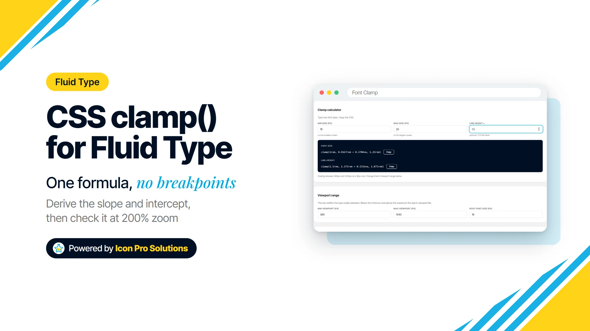
Font Clamp is a free calculator on our site that does the arithmetic above with the same slope and intercept formula, rounded to four decimals. Set the viewport range to 360 and 1440 at a 16px root, enter 16 and 20, and it returns clamp(1rem, 0.9167rem + 0.3704vw, 1.25rem).
- Clamp calculator: two sizes in, a
font-sizeclamp and a matchingline-heightclamp out, from a multiplier you set or 1.5 by default. - Type scale table: start from a 3, 11 or 7 token preset, then edit, add or remove rows, with a ratio column that sets both line heights.
- Output: a
:rootblock of--fs-and matching--lh-variables to copy or download as a .css file, plus a live preview.
Know its limits. One viewport range covers the whole scale, sizes are typed by hand rather than generated from a ratio, and line heights come out as rem lengths rather than unitless numbers. It does not test zoom or WCAG, so the 200% check is still yours.
If you want help putting a type system into a real site, see our web design service. You can also book a free consultation to talk through a project.
FAQs
Can clamp() Be Used for Properties Other Than Font Size?
Yes. MDN’s own syntax examples use it on width, and the same slope and intercept method works for any length you want to scale, such as padding or gaps.
Why Does My clamp() Value Not Change When I Resize the Window?
Check whether the window is outside your viewport range, where the value is meant to hold flat, and whether the minimum and maximum are equal or the wrong way round. Test by resizing across the range itself.
What Viewport Range Should I Use?
Use the narrowest screen you actually support as the minimum and the width your design was drawn at as the maximum. A wider range makes the text grow more gently, and a narrower one makes it grow faster, which puts more of the value in vw.
Should Line Height Be Fluid Too?
It can be, with a matching clamp that keeps line spacing in proportion as the text grows. A unitless line height, such as 1.5, is simpler when one ratio suits every width.