


The Figma logo is more than just a brand mark. It’s a symbol of collaboration, simplicity, and modern design thinking. Whether you’re a UI/UX designer, developer, or content creator, chances are you’ve seen or used it. But have you ever stopped to explore its story and guidelines?
What Does the Figma Logo Represent?
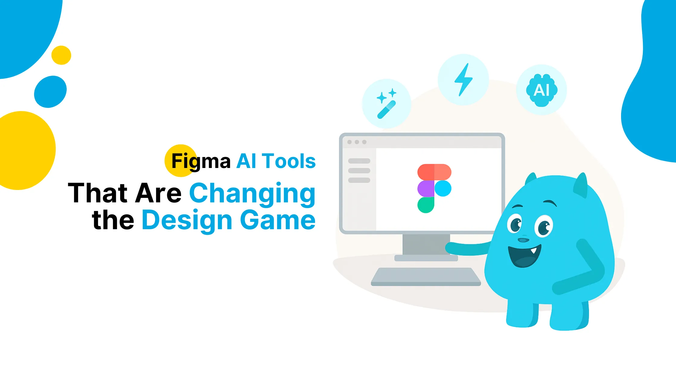
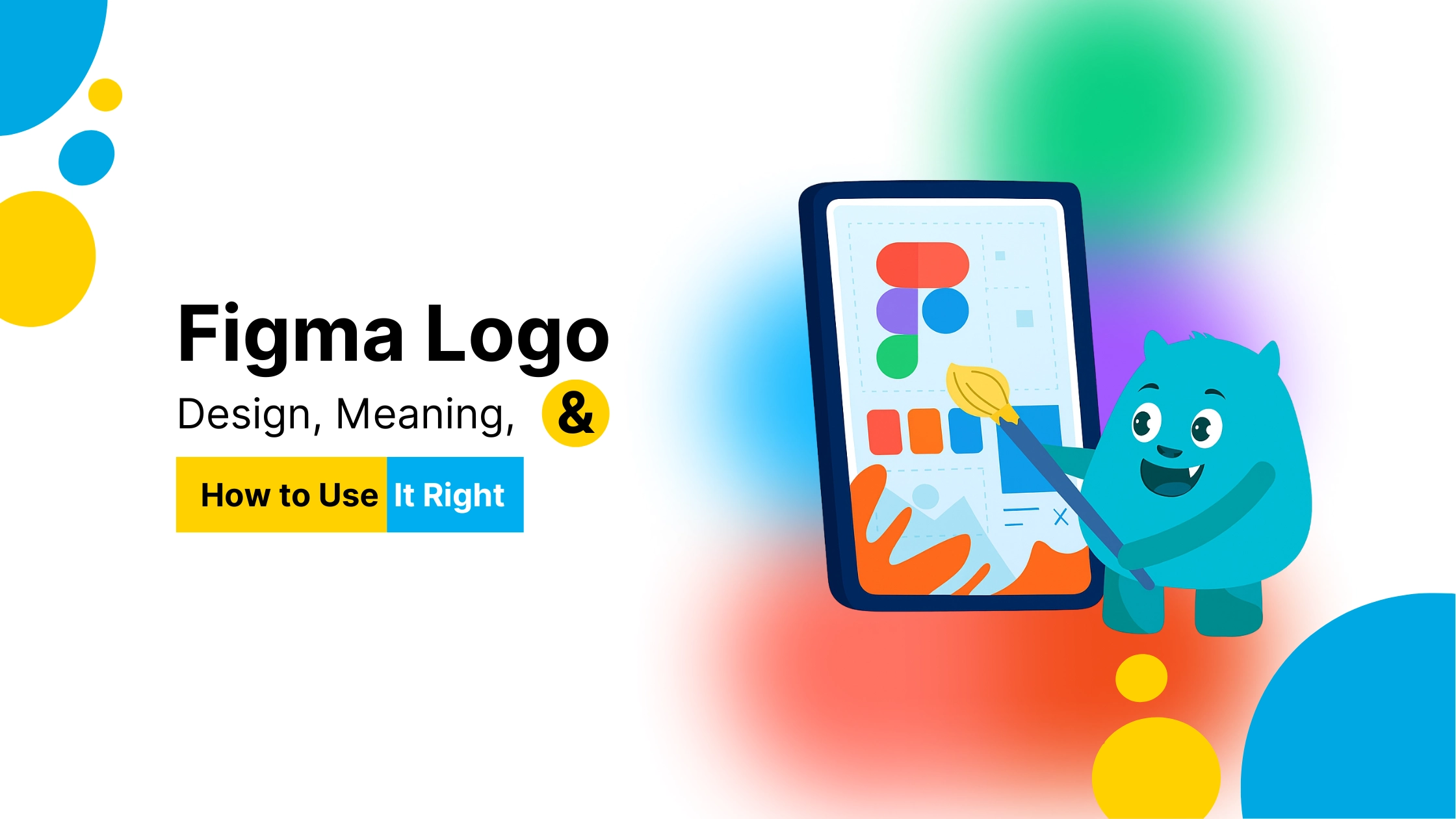
Figma’s logo is instantly recognizable, five rounded shapes arranged vertically in a way that feels playful yet precise. Each shape represents a part of the platform’s DNA: creativity, collaboration, flexibility, and community. The colorful blend shows how different design ideas and people come together.
Figma was built for teams to design together, in real time, and the logo reflects that same energy, simple, functional, and open.
The Evolution of the Figma Logo
Figma hasn’t changed its logo dramatically since launch. Instead, it has refined it to be more responsive and usable across digital interfaces. From desktop screens to mobile apps, the Figma logo is crafted to adapt, resize, and retain clarity.
The typeface paired with the logo is also minimal and modern, matching the UI of the product it represents.
Where Can You Download the Figma Logo?
You can find the official Figma logo on Figma’s Brand Guidelines page. They offer downloads in different formats, SVG, PNG, and EPS, for dark or light backgrounds.
But it’s important to follow the brand usage rules. Don’t change colors, stretch the logo, or add shadows unless permitted. This ensures brand consistency across communities and platforms.
Best Practices When Using the Figma Logo
-
Use the logo only in Figma-related content or tutorials
-
Avoid editing, recoloring, or animating it unless allowed
-
Leave enough padding around the logo to maintain clarity
-
Pair it with neutral colors when used as a badge or footer mark
If you’re creating a design tutorial, YouTube thumbnail, or social media carousel about Figma, the logo helps build instant trust with your audience.
How the Figma Logo Builds Trust in Design
Figma’s branding has become synonymous with innovation in design collaboration. When people see the logo, they associate it with speed, teamwork, and clean user experience. It’s one of the few logos in tech that has both designer appeal and general user recognition.
Using the logo smartly can add professionalism to your educational content, templates, or even client presentations.